

Our logo & icon
Our Logo
Colour Variations
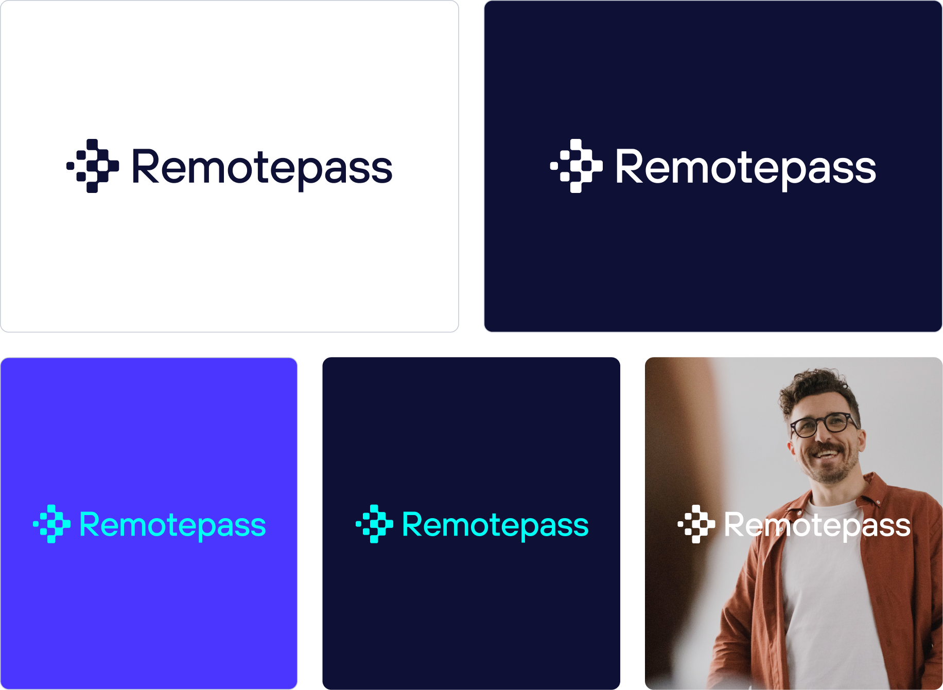
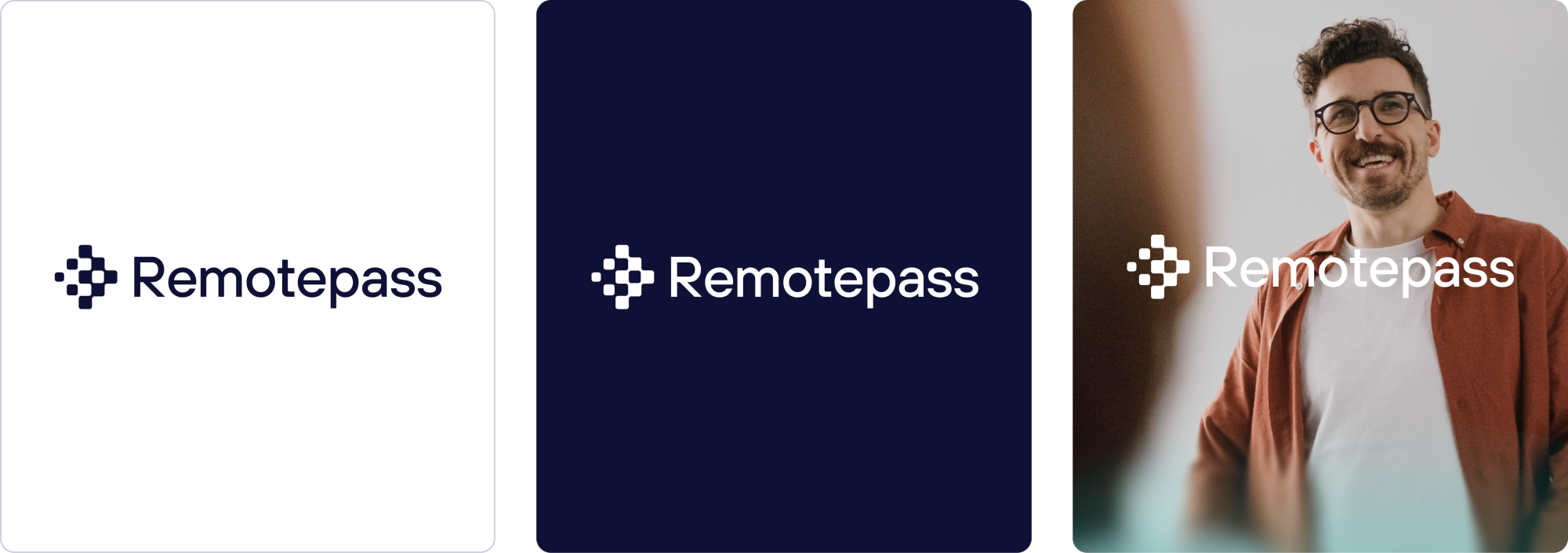
The primary logo is supplied in colourways: navy, indigo and white. Bright teal with navy and indigo can be used for marketing assets. Always choose the version that ensures clear visibility and strong contrast with its background.
Note: We do have a full black logo just incase.
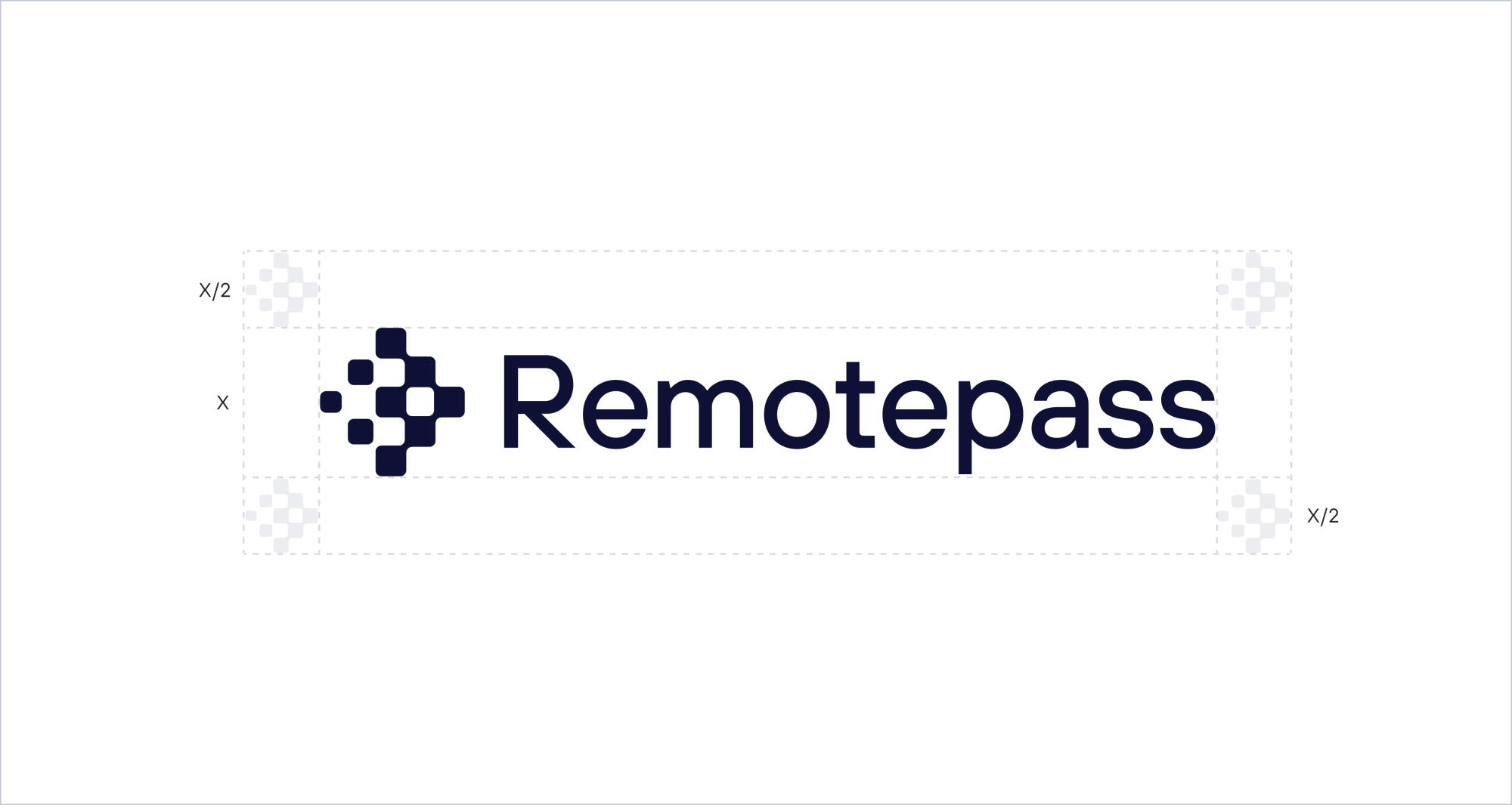
Clear Space
Use 50% of the icon’s size to determine the minimum clear space around the logo. This area must remain free from any other design elements.
Rules
Our logo is our most sacred asset. Please treat it with the utmost respect.
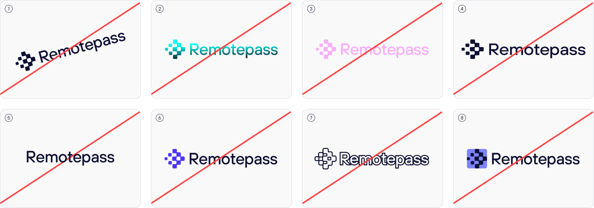
- Don’t angle.
- Don’t add gradients.
- Don’t use secondary colour.
- Don’t Stretch.
- Don’t remove the icon.
- Don’t use multicolour.
- Don’t Stroke.
- Don’t fill the icon
Our Icon
Colour Variations
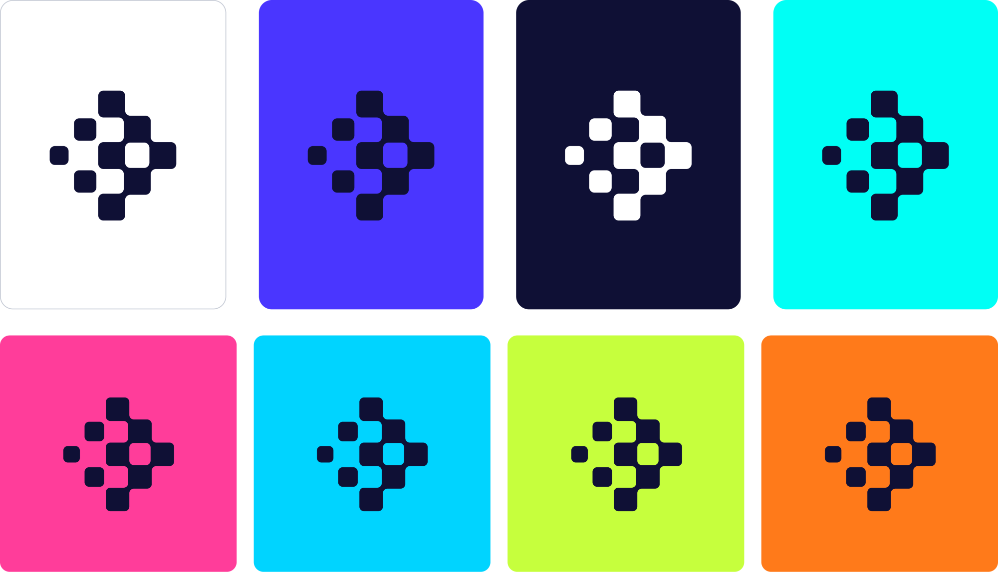
The brand icon is supplied in three main colour ways: navy, indigo and white and a backup in black. Always choose the version that ensures clear visibility and strong contrast with its background.
Note: Do not change the colour of the icon.
Clear Space
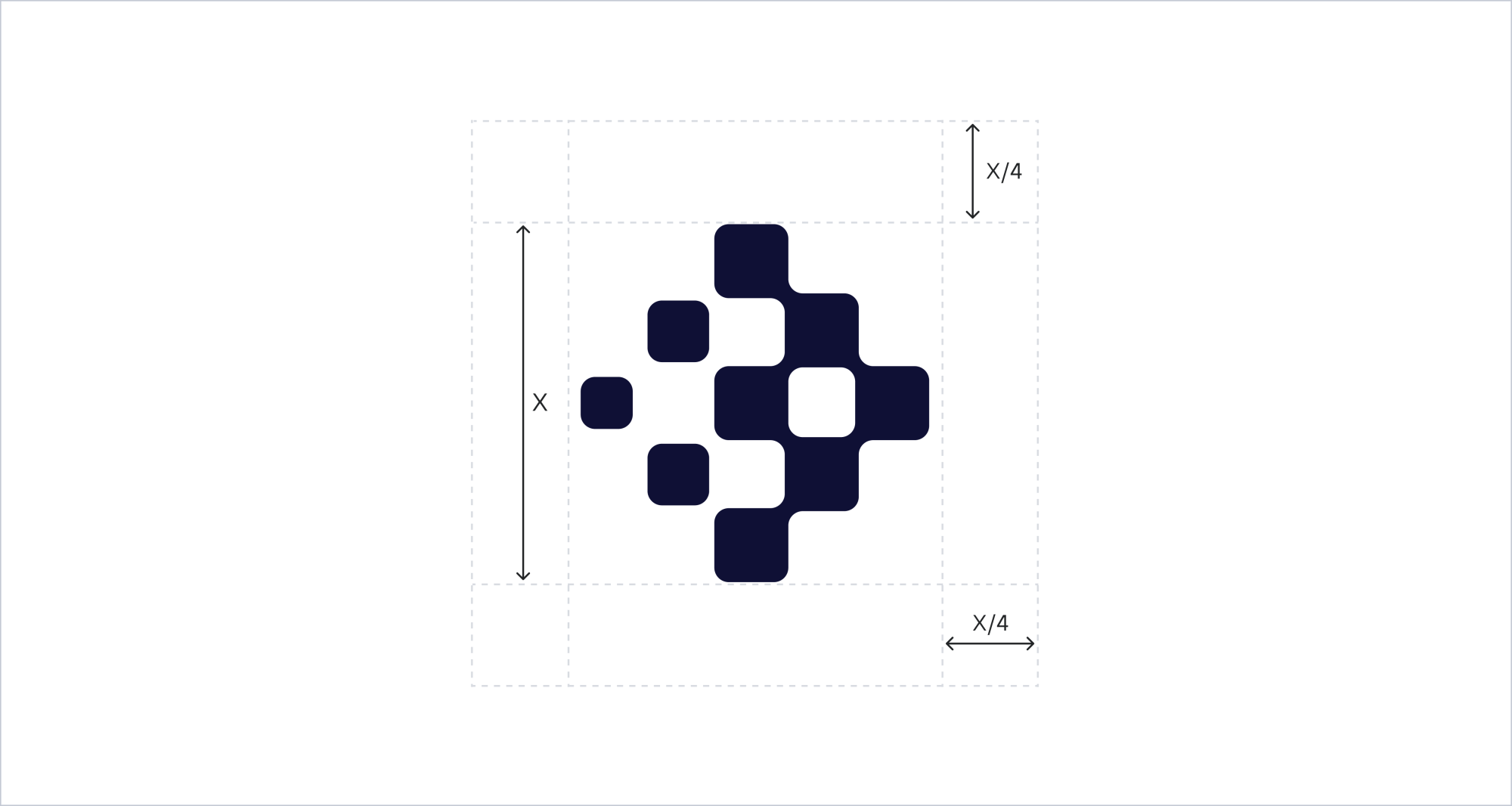
Clear space is defined using a quarter of the icon’s height (X/4). This measurement is applied on all sides to ensure the icon has enough room to breathe and remains visually clear across applications.
Logo Animation
For Remotepass, motion reflects every movement is eased and human, never mechanical. It’s the platform in motion: EOR, Contractor, Payroll and Spend aren’t bolted together; they’re one system that reconfigures around whatever comes next.