Graphics & Imagery
Shapes
Our shapes are our primary visual language; they’re bold, dynamic and flexible, just like Remotepass. Be confident and abstract with application; however, there are some rules we need to consider;
- Ensure consistent padding around the complete shape, at least on three sides.
- Ensure there is at least one ‘cut out’ in the shape
- Corner radius: 24px (if scaling up, do so in that ratio)
- Use either only mask or one block colour
- Keep in mind colour rules/ pairings.


UI Application
Solid Colour
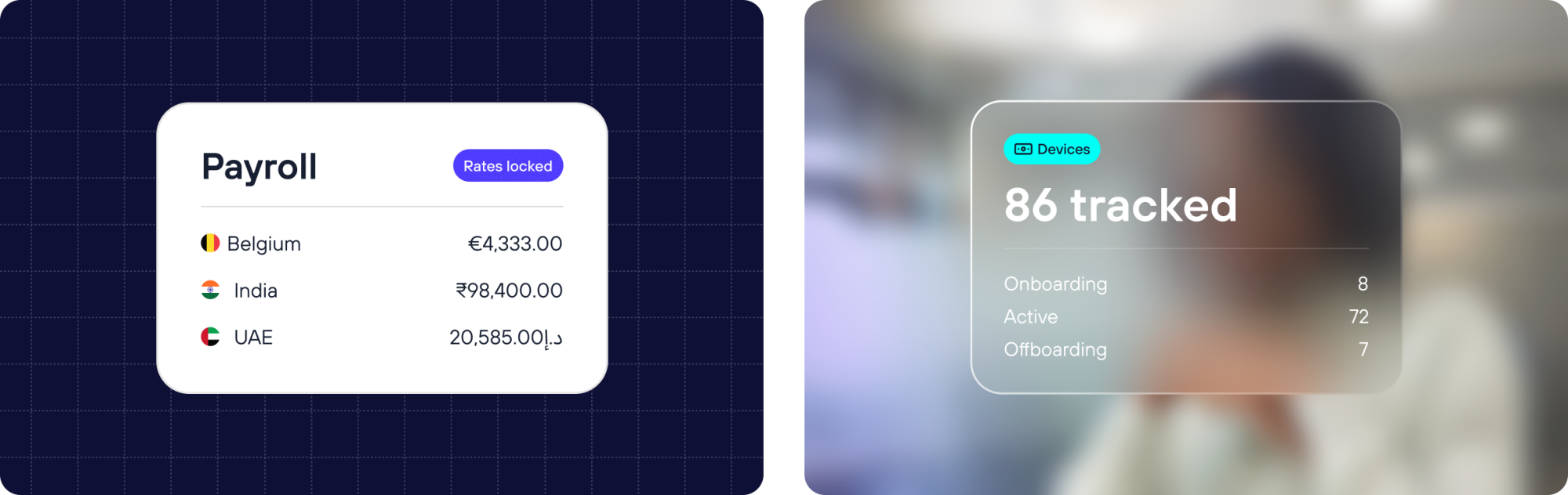
Always applied in white. This is our clean, high-contrast default – used where clarity and simplicity take priority over depth or texture.
Glass UI
Our glassmorphic style, which can sit on top of either a solid brand colour or photography, adds depth and a modern, layered feel to our interfaces.
Contrast rule
Legibility comes first. When applying Glass UI, always aim for maximum contrast between the UI content and what sits behind it. To achieve this:
- Apply a background blur to the image or colour layer behind the container
- Apply a background blur to the UI container itself.
- Lower the UI’s white opacity for stronger contrast.
Using both together softens the backdrop enough that text and icons stay clearly readable, no matter what sits underneath.
Working with multiple widgets
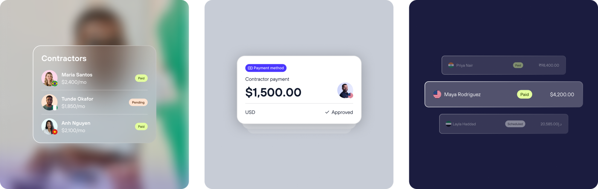
When several UI widgets appear within one container, use opacity to create visual hierarchy and depth:
- Vary the opacity across widgets so some recede and others come forward
- Layer widgets at differing opacity levels to build a sense of depth rather than a single flat plane
Detail
While it’s tempting to add depth and detail to our UI widgets, restraint is what keeps them effective. Simplicity ensures the message lands clearly, without visual noise competing for attention.
Keep UI widgets simple. Every additional layer of detail or realism should earn its place – if it doesn’t clarify the message, it’s noise.
Iconography
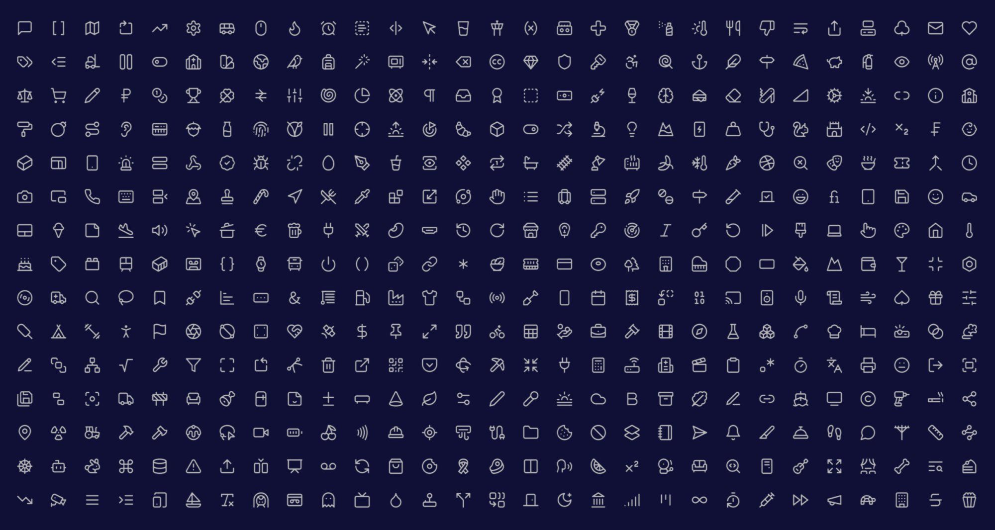
Library: Lucide
Icons help us communicate quickly and visually where words alone are less effective. All icons are sourced from Lucide, our chosen open-source icon library, ensuring visual consistency and easy scalability across the brand.
Usage rule: When resizing icons, stroke/line weight must scale proportionally with the icon size. This keeps icons visually balanced at any scale – avoid icons that appear too heavy at small sizes or too thin at large sizes.